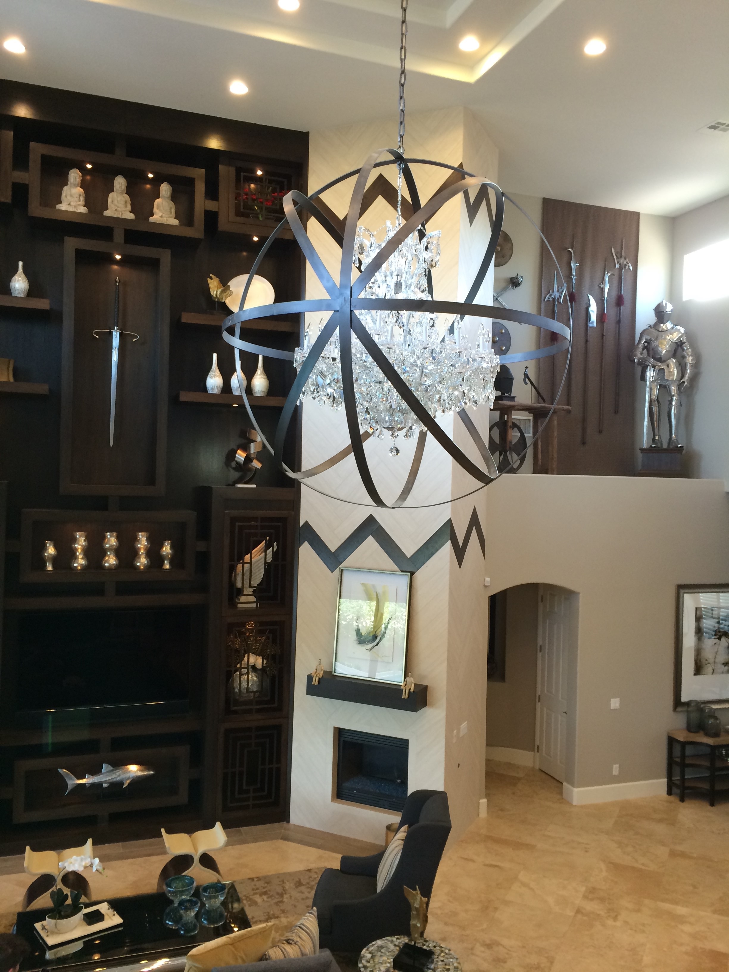
We totally remodeled a four-bedroom, 5,400-square-foot house in Las Vegas to give it the function and style that suit us (you can see the results in our HGTV series, The Property Brothers at Home—catch all four episodes back-to-back starting at 6 p.m. EST on Saturday, Dec. 20.)
It's our desert oasis, a refuge from our crazy schedule, a retreat for family and friends designed for good times. Here are some tips from it that may help you enhance your home.
Save money where you can so you can splurge where it counts
We initially wanted to replace the kitchen cabinets but decided to just replace the doors and give them a rich finish. We kept the travertine flooring, which would have cost a lot to change, and made it work better with harmonious hues on walls and furniture. Those decisions added to our budget for more important upgrades, like high-end appliances.
Highlight meaningful objects by editing them
It's better to rotate favorite things than to show so many that they become clutter. In honor of our Scottish heritage we collect medieval weapons and armor (we know... it's a guy thing). They're showcased in a high wall niche and (with other objects we like) on the living room's 26-foot-tall display wall. It's always good to feature things that have personal or local significance; in our game room, we paid tribute to classic Vegas neon with a custom, retro-style sign that spells "Lucky" over a symbolic horseshoe. Remember to give your treasures enough breathing room. As with garden plants, apply the Rule of Three, which says that for aesthetic appeal it's best to group objects in odd numbers of at least three. But that rule can be trumped by the appeal of simple symmetry; for example, the pair of lacquered blue nightstands in Drew's bedroom.
Use lighting to make a statement

Jonathan designed a dramatic, metal-and-glass chandelier as a focal point for the living room. A ceiling light with strings of glass balls like Champagne bubbles adds flair to his bedroom's soothing, monochromatic color scheme, while the one in Drew's bedroom, a circular, art deco-flavored design with bronze accents, fits the room's Parisian influence. Distinctive lighting fixtures complement the clean-lined furniture we favor as jewelry does a simple black dress.
The house reflects a trend we like: bringing elements of stylish hotels and resorts into home design. Getting that upscale resort feeling doesn't have to be super-expensive. Little upgrades, from better fixtures and finishes to coordinated color schemes to making sure every room has at least one eye-catching feature, can make a big difference. We focus especially on bathrooms, where improvements such as bigger tubs, separate showers, double sinks and attractive tilework can create a relaxing, rejuvenating space.
Do some landscaping
When we bought the house, the yard was basically just dirt. We not only landscaped it but turned the backyard into a fabulous fun zone that includes a swimming pool with a swim-up bar and a two-story water slide (whoo-hoo!), an outdoor dining area with a fireplace, a drop-down projection screen for outdoor viewing, a basketball court, a putting green, and a dog run for Jonathan's furry friends. This may be way over the top compared to what you want or need, but the principle is the same: Anything you do to make your home more enjoyable for your leisure time will make it more attractive to guests and (one day) to potential buyers.
Connect with us on Twitter and Facebook: @MrDrewScott/ https://www.facebook.com/MrDrewScott
@MrSilverScott / https://www.facebook.com/MrSilverScott


